Creating animations in general on our websites can be very tedious to deal with, going from compatibility problems across all the browsers to them working on our mobile devices, not only can this be time-wasting but it'll certainly be nerve-wracking. Today we will be looking at one of the best solutions out there to create a stunning 3D parallax hover effect using Atropos.js Library.
Would you rather watch a video on creating parallax effects instead?
The following tutorial is based on the video above. So, let's get started!
Installing Atropos.js
Atropos offers two ways to get installed:
- NPM (Node Package Manager)
- Manually adding Atropos files to your project
In this tutorial, we will be using the second option but you're free to use whichever option that suits you.
Head over to the Atropos Github repository:
https://github.com/nolimits4web/atropos/
Download the package, unpack it and make sure the following files are in your project directory, since these are the only main files that we need to get the effects working:
Setting up The Project
Now, we will be creating our index.html and adding our boilerplate in VS Code by using !+Enter
Make a CSS folder with a main.scss folder within it, and then we can go ahead & link our main.css by in our index.html file:
Open up the main.scss file in your VS code and then click on "Watch Sass" on the bottom navbar, in case you don't have this make sure you have Live Sass compiler & Live Server Addons installed on your vs code, you can install them through the browser or go to your VS Code addons section and install them from there.
Sass is basically a preprocessor for CSS, if you wanna know more about it then make sure you check out the video below:
Going back to index.html, we add the basic Atropos layout using the following code below:
Now we link Atropos.min.js to our index.html using the following code:
And for the final step of setting up our project we go back to the <head> element of our index.html file and link the Atropos.css file:
You can test if it's working by adding an <h1> under the atropos-inner div then we can go ahead and open it with the live server to check if It's working!
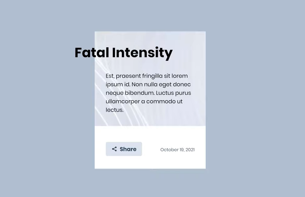
Writing the HTML
Let's start by adding the following code:
To break down what we have here:
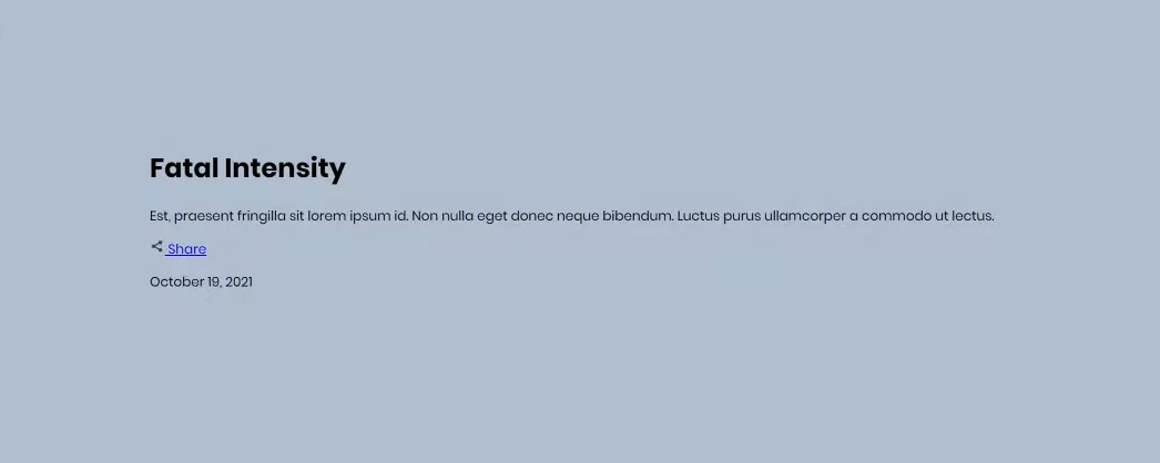
- Container: This contains the card that we will be working on.
- H1 (Heading 1): The title of the card "Fatal Intensity".
- P (Paragraph): Contains some "Lorem Ipsum" text.
- Footer: An element that wraps around the CSS grid.
- Button (Share): Share button with a little icon using SVG.
- Date: Date at the bottom right corner of our card.
Writing CSS & JS
We go back to our main.scss file to style our card and we start by adding some structure & background color to our body:
Let's break down these elements as well:
- Background: We use #B0BFD1 as our background color.
- Margin: set the space around elements to 0.
- Height: Set the height of the body to 100 view height since we're only working on one element.
- Display: we wil be using grid layout for our page.
- Align-content: center to Justify the grid content on column axis to center.
- Justify-content: center to Justify the grid content on row axis to center.
- Font-family: to use Poppins as our text font, you can either install this on your machine or just import it on your scss file if you don't have it.
This is the result so far:
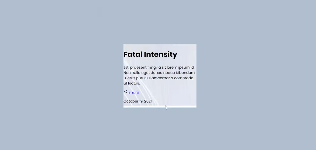
Now let's style the first element in our HTML page which is my-atropos by making our card have 320px width & add the background image from our design with some x & y values for proper positioning:
Looking good so far:
Now let's style our h1 element:
- Font-size of 2.4rem units, in case you don't know rem is relative to font-size of the root element.
- White-space: nowrap to force our h1 to stay on one line if there's no width space available for it.
- Margin-top: 0
- Transform: translateX(-90px) to move our h1 to the left by 90px.
so far we're slowly getting there:

Let's go ahead and make our HTML element not get cut off by adding:
- overflow: visible
- position: relative
to our .atropos-scale, .atropos-rotate, .atropos-inner that we got from atropos css and to the .container that we created.
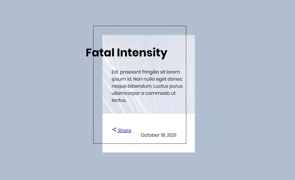
Now let's add some padding to our container to move our content away from the edges of the card and also add the pseudo-element &:before with attributes in it to add the dark line that you can see in the GIF on top of the container:
&:before contains:
- Position: absolute.
- Content:' '; since we want it to be empty.
- Height: 100% & width: 100% to make the pseudo element always have the width & height of the parent element which is the container itself.
- Border: 1px solid black; this gives the element black borders around it.
Moving along to the footer, we will be giving it the following elements:
- Margin-top: 5em.
- Display: grid, since we have 2 elements inside of it which are the share button & the date.
This gives us the following results:
When it comes to establishing a solid parallax effect, you want to "layer" multiple visual elements to help the effect take shape.
As you can see each element has its own column but they're not quite positioned correctly yet, let's go ahead and style our button by referencing it inside the footer itself like this:
Everything is really just positioning components while removing the underline of our link by using text-decoration: none;
Pretty straight forward so far but the button icon is a little bit off towards the top which can be fixed easily by moving it down by 3 pixels using transform: translateY(3px) and margin: .2em to the right of it.
While we are at it, let's also style the date:
Now looking at the results, you can see that everything is looking great but that border around our element is right up against the edge of our date, and our button. To fix this we can use multiple methods but in this tutorial, we will be using the clip-path method, Let's go back up to the pseudo-element &:before of our container and add the following clip-path:
This completely hides our border but we still want it to show up when we hover over the element which is why we will add the following class & pseudo element :before to change it back to the line around the element:
You won't see any changes yet as we need to toggle it whenever we move our mouse over, This is where we add some Javascript magic.
Let's add the following code inside the Atropos value in our script tag:
This still doesn't add any effects to our design but if you open up the developer console by clicking on F12 you'll notice that whenever we move our cursor inside the element, it logs "Enter" and when we remove the cursor from the element it logs "Leave", So it definitely works just not the way we want it so far.
To get our border working we need to reference our container element & attach .add-border class to it whenever the cursor enters the element, So let's go ahead and add the following before Atropos:
And inside our onEnter() event, we will be adding the class add-border:
We can see the border once the cursor enters the element but the border stays there when it leaves, Let's fix that by removing the class add-border onLeave event:
The border disappears now whenever the cursor leaves the element but it's not as smooth as we want it to be, let's go ahead and add a transition to the element, so let's go all the way back to our main.scss file and right under the pseudo-element &:before of the container class, we will be adding transition: clip-path.
Now let's make our title become bigger whenever we hover over the element, Let's go back to our Javascript and select our h1 like this:
And under our onEnter event, we can scale it up to 1.15 & keep it on the left side using translateX(-90px) just like what we did in our sass.
Of course, this will make it stay large cause we only scaled it up onEnter and we have to make it scale back to its original size whenever the cursor leaves, we can do that by setting it back to 1:
Looks nice but the text doesn't have a smooth transition, We can add it by going back to our h1 styling and adding:
And This is the final result:
You can play around with it and see the entire source code through our Codepen, also feel free to check out the Atropos documentation, you'll see plenty of parameters that you can play around with however you want, It's a preference so see what suits you best!