A 404 Error Page is an important component of any website. By using the right design practices and avoiding common mistakes we can not only improve the user's experience when they land on 404 page but also help them stay longer on the website.
In this tutorial you will learn how to design proper 404 pages by analyzing users' problems looking at various examples and understanding the purpose of a 404 page.
Would you rather watch a video on the UI/UX of 404 Page Design?
The following tutorial is based on the video above. So, let's get started!
What is a 404 Page?
A 404 error occurs when a user clicks on a link that takes them to a page that doesn't exist. This could also happen when a user incorrectly types in a URL and tries to access a page that doesn't exist. Whenever that happens the user gets redirected to a page which is called a 404 Page.
Many designers tend to make some mistakes that cause users getting confused when they end up on a 404 page and forces them to click away from the website in frustration.
That's why it's important to follow certain practices when designing a 404 page which allows users to know why they landed on a 404 page and make them stay on the site by improving their experience.
Common Mistakes in 404 Pages
Let's look at the following examples of 404 Pages and see how these designs can be improved.
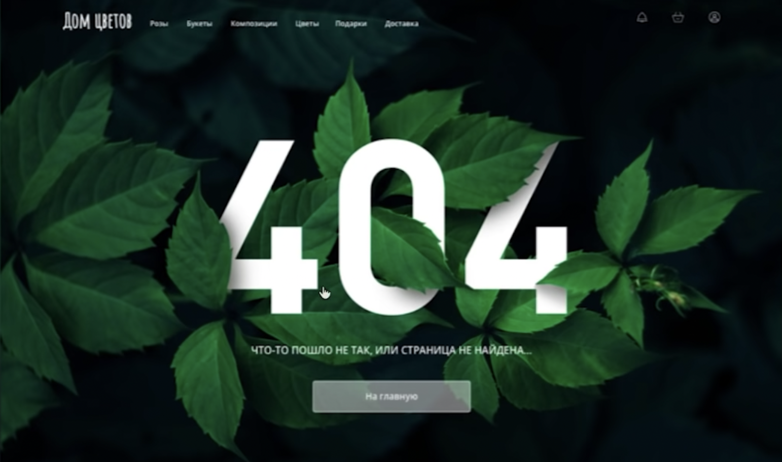
The first example we have here looks really good at first glance in terms of the aesthetics. However, from the perspective of UX, it gets certain things wrong.
The issue in this page is that the emphasis is placed on the 404 element.
An average person might not even know what 404 means. So when it's given the priority in terms of the visual hierarchy by making it the main element of the page, it could end up confusing the user.
Let's say a user clicks on a link expecting to find relevant content but instead ends up on a page that just has a huge text saying 404 along with smaller elements such as links.
You see the problem here? This kind of design creates confusion for the users who do not know what 404 is.
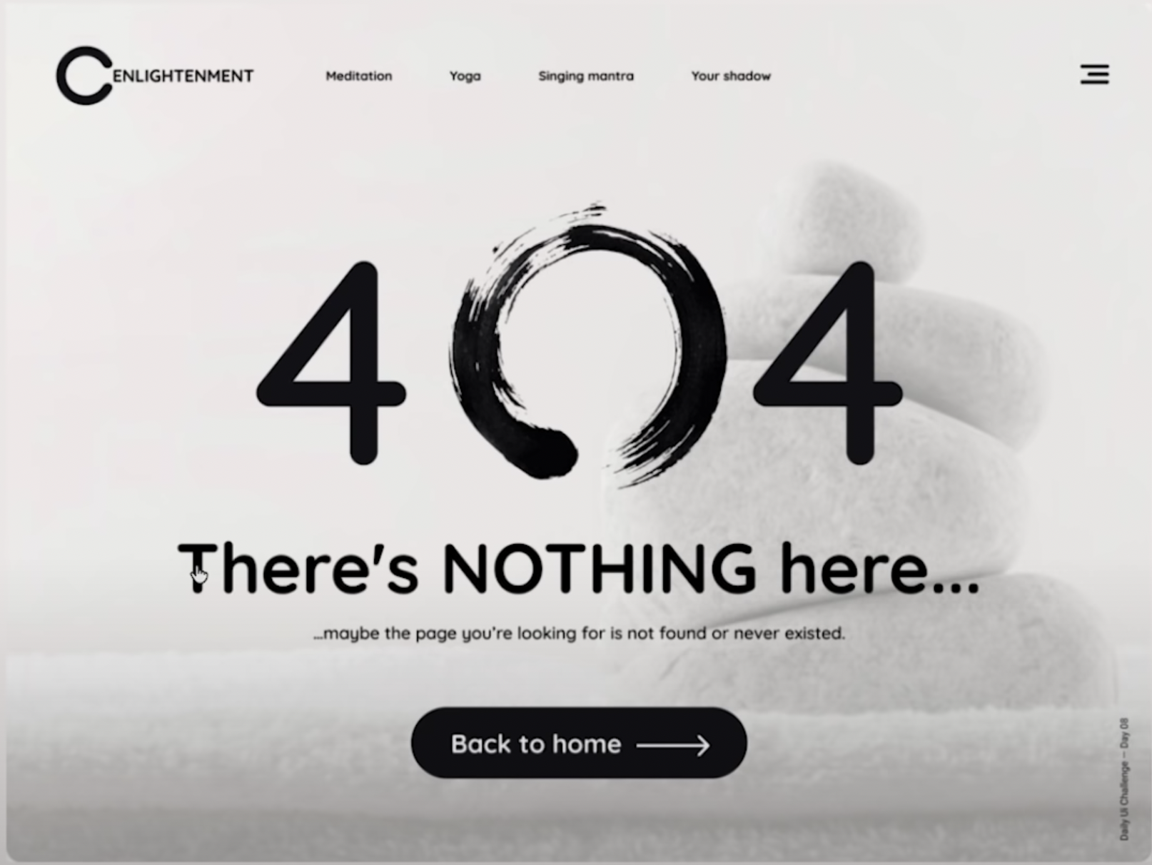
Let's look at another example. This page is better than the previous one as it has a secondary element "There's nothing here..." providing additional information to the user.
However, the secondary element is too vague and doesn't clearly address the issue to the user.
As a designer it is essential to understand the problems and frustrations a user might encounter and empathize by putting ourselves in the shoes of the user while designing pages.
The Goals of a 404 Page
Now that we know the common issues present in most 404 pages, we can try to solve them by first defining the goals/purpose of a 404 page.
The goals of a 404 is to inform the users of what's happened and to keep them on the site which is generally represented by bounce rate.
Bounce rate represents the number of people that leave the site after landing on a page instead of continuing to stay and view other pages.
Generally 404 pages have a high bounce rate because the content the user was looking for isn't present so they would naturally want to leave.
We need to try to keep the user stay longer or in other words, reduce the bounce rate as much as possible.
404 Page Requirements
- Address what's happened in a single sentence: Inform the users what exactly happened in 1 sentence and make it the biggest element to avoid confusion. Use appropriate verbiage to keep the message clear and simple for the user.
- Given them new destination(s): Guide the users giving them destination(s) to go to. They could be frequently visited pages with high traffic. This can also reduce the bounce rate. A search bar could help users find what they want easily and help them stay on the site longer.
- Keep it simple: Keep the layout simple and don't clutter the page with too many elements.
Examples for 404 Pages
Let's wrap it up by taking a look at examples that can help you design better 404 pages.
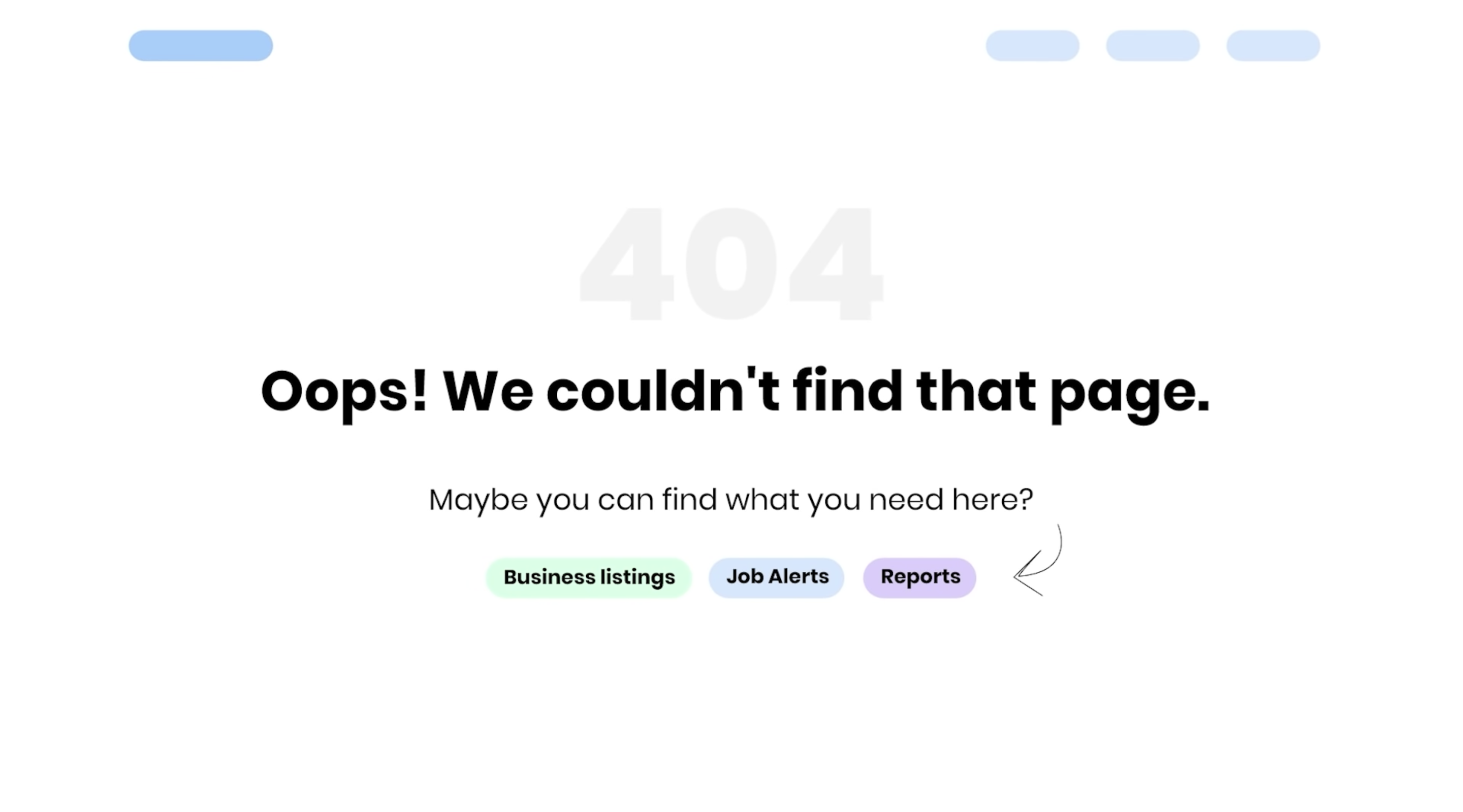
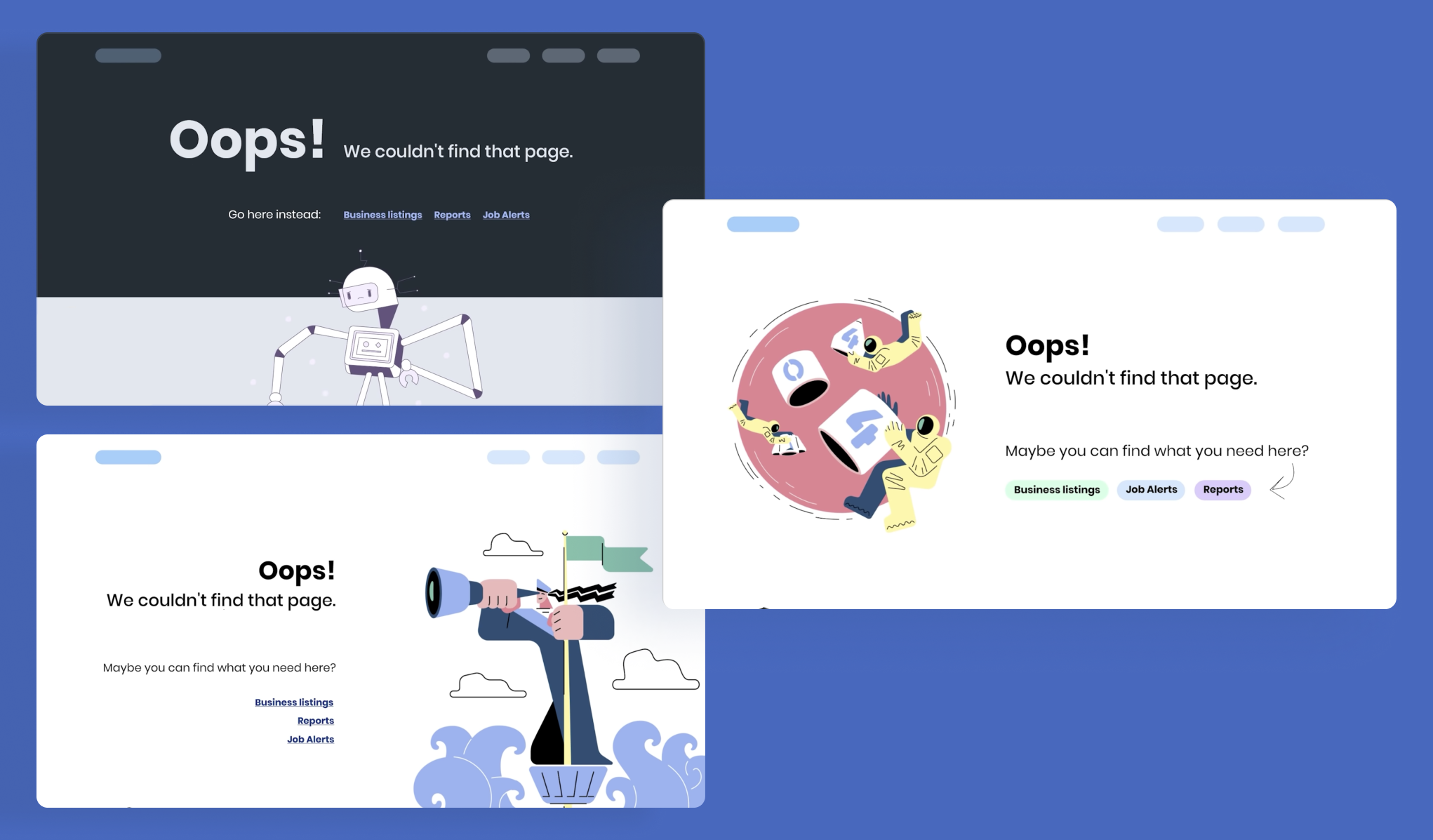
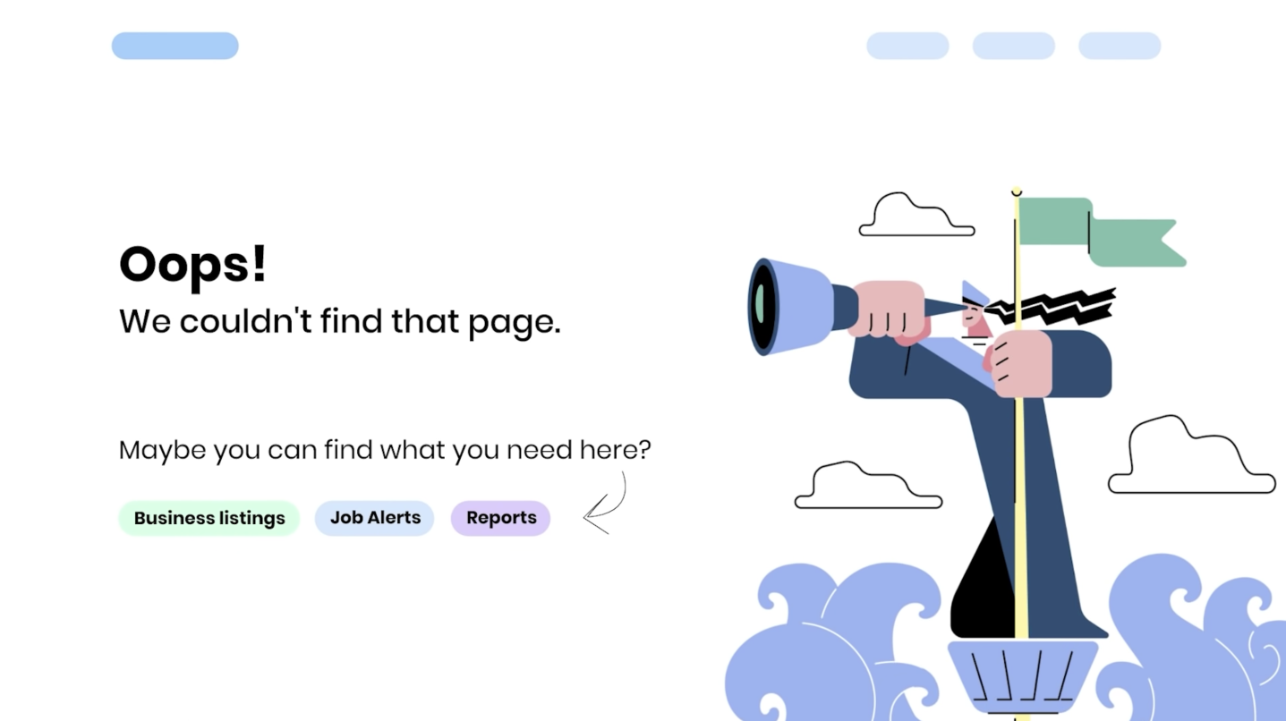
As you can see, in this design the emphasis is on the text "Oops! We couldn't find that page."
This clearly tells the user that the page they are looking for isn't present.
Additionally, a secondary element is present to prompt the user to use the options below to navigate to other pages. While it does have 404 present as a design element, it is only kept as a watermark and isn't given the most emphasis.
To make the page more appealing you could use relevant illustrations in your 404 page.
A great resource for finding illustrations specifically made for 404 pages is error404.fun.
Also, try experimenting with different layouts to make the design interesting. Have a look at these designs for more inspiration.