If you’re a website or app designer looking for an easy-to-understand Figma tutorial, you’ve come to the right place! To help you learn the basics of UI design in Figma, we’re going to design this sample home page:
We'll learn fundamental design concepts, website structure elements, and also jump into some interesting user interactions to make the website more appealing.
Do you prefer watching a video instead? Check out our UI/UX Crash Course on YouTube!
Figma UI Overview
When you create a new design project in Figma, you’ll come across this user interface:

The first thing you need to click on is the Frame tool. This will give you different options like desktop, tablet, and mobile.
When designing a website, make sure to start with the largest view first, which would be desktop view.
Clicking on “desktop” creates a Figma layer, which is like a separate page of your website.
So if your website has 4 different pages (Home, Services, About, Contact) - then you would create 4 different Figma layers.
As you build out your prototype, each Figma layer will also have layers and components nested inside.
Pro tip: The default background in Figma is a light grey color. If you’re working on UI design project with similar colors, click on “Background” on the right as shown here:

Choosing a Background
The background is the first thing we should consider when we first create our Figma UI design.
Remember, our sample website is a dark-themed travel website focused on tropical water imagery. For our background color scheme, we could choose a simple solid color or have an actual photograph as our background.
Whichever option you choose, make sure to allow for good contrast (especially if you’re going to have text sitting on top of the background). Otherwise, the text will be very difficult to read.
The photo I chose has high contrast between the waves (dark blue) and the color of the water (white).

I also increased the height of the background by filling the bottom with a color that matches the hue inside the photograph. Here’s how I did it:
- Fill (click the + icon)
- Choose the color picker and grab a color in the photo of the waves
- Adjust brightness and tone as necessary
Adding a Layout Grid
Layout grids are red guides in Figma that help us consistently align our content.
The default option for layout grids isn't as helpful as the column view, so make sure you choose “Columns” in the Layout grid.

I also like to change my column grids to white and opacity to 5% so that it doesn’t distract me from the actual designing of the project. Otherwise as you can see in the screenshot above, you won't be able to see the blues and white of the ocean waves when putting images and text during the design process.
Without layout grids, it would be very difficult to figure out if you have a good amount of white space (so that the design is more appealing to our readers’ eyes).
And unless we’re having a completely fluid design that goes to the corners of the screen, layout grids also help us know where the website begins and where it ends.
Pro Tip: If the layout grids aren’t sufficient for alignment purposes, you can also press Shift-R to bring up rulers guides.
Designing a Quick Logo
This isn’t a logo design tutorial. However, UI designers commonly use masks when working with projects.
Masks are tools that allow you to hide, duplicate, or reveal parts of an image.
Creating a quick logo in this tutorial will help get you comfortable with using masks in Figma.
We’ll be using masks to create the logo for our sample website, Ocianica:

Here’s the steps to create the logo:
- Create an Ellipse.
- Take the pen tool, hold Shift around the center of the ellipse, then left click and drag diagonally down the right. This creates the left half of the wave.
- Left click one more time and you can create the wave.
- Afterwards, select all of the items and then click on the Use As Mask icon as shown below:

(Refer to 24:33 in the Youtube video if you’d like more detailed step-by-step instructions).
Creating your First Component
Creating a component allows us to replicate elements (such as a logo, footer bar, navigation buttons, etc) that appear on multiple different pages for a website.
For example, if you have 20 different pages for your website, changing the logo on each of the 20 pages would be annoying and time-consuming.
Instead, we can create one component which acts as a template. That way, one change to the template will create changes automatically across ALL pages of the website.
You’ll click on this icon to create a component:

Here we’ve created a component of the logo.
Now if we want to change the logo to red across all pages, we only have to do it in one location.
Creating the Navigation
Next up for our webpage is to design a navigation bar.
One thing you want to note is the font size of the navigation bar. We want to make sure there is good typographic visual hierarchy by having the logo stand out from the navigation itself.
We can reinforce the visual hierarchy of the navigation bar by making these changes to the font:
- Font size
- Underline
- Bold
- Color
- Icon
Don’t forget white space. Here in this example, we have 58 pixels in between each navigation bar element.

We can also add a cool hover feature where the link is highlighted whenever the mouse pointer hovers over the link.
For the color choice, I’d recommend using a lighter color hue like the one seen in the waves of the background.
The navigation bar should also have a call to action, which is a button, form, or a scroll indicator icon telling somebody to scroll down.
Typically, when you have a navigation bar like the primary navigation bar at the top, you might have one element that sticks out further. This is the single action that you want the reader to take. Usually, it's to purchase the service or product. Other times it can be used to book a call or schedule a consultation.
The call to action should be styled differently from the rest of the navigation bar to catch the attention of the eye. In our example, we did the following:
- Changed the font size
- Added a light teal color
- Created an arrow pointing to the button
Take a look at the completed navigation bar on the right and notice the alignment, white space, and font attributes - all of which creates a nice visual hierarchy for our reader.

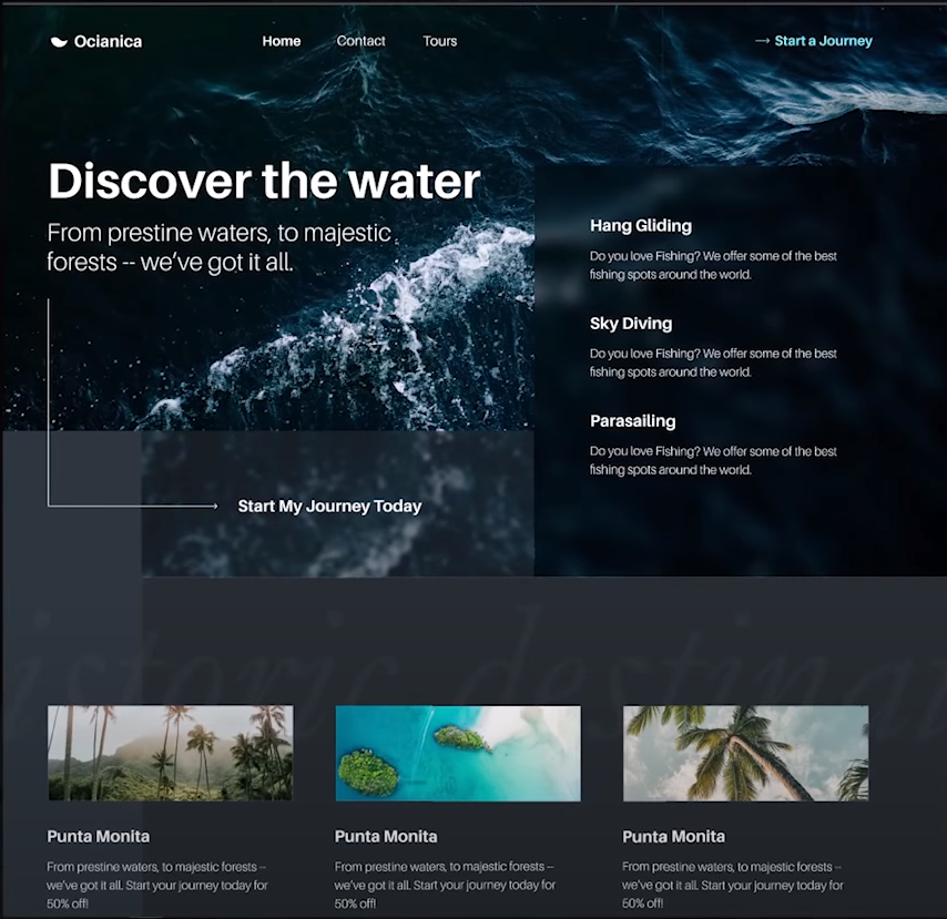
Designing the Hero Section
The next thing that you're going to find on a landing page or the homepage of a website is what's called the hero section.
This is the area where you have your large headline, which emphasizes the benefits of the company or service. Many times the headline will be accompanied with a subheadline, a description, and a call to action as well. Sometimes you'll have an illustration. The hero section can vary a lot.
Let’s start with the visual hierarchy of the headline. The first and easiest way is to make the headline standout is by making the font size significantly larger.

I also cropped the photo in the background so that the word “water” isn’t located on top of the white wash in the background photo. The white color of the word “water”overlayed on top of the white wash would make the headline difficult to read.
The subheadline gets more specific about the details of the service, but it shouldn’t compete with the headline visually. We can do that by altering the size and thickness of the font as well as the alignment relative to the headline.

Adding Features
Next, we’re going to be adding a features section, which includes titles and a description outlining the various things you can do for this sample company.
First, we're going to employ a technique that's sometimes referred to as glass morphism. Using a blur effect, we create a visually distinct block that stands out from the background and headline (notice that it’s also aligned at the top with the headline too).

Then we’ll add three different rows of titles and descriptions that are all styled the same. Notice how the titles are bold and larger than their respective descriptions - an example of good typographic visual hierarchy.

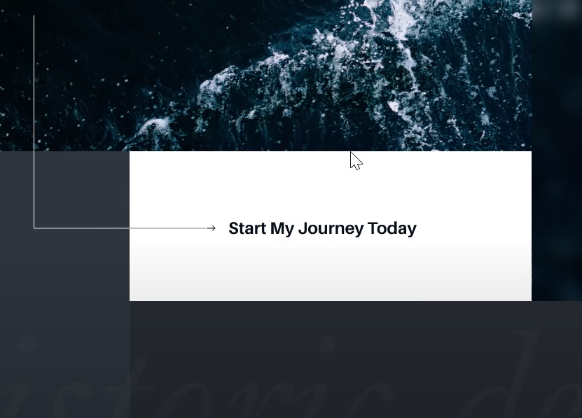
Call to Action
We want to have a call to action button that is going to demand more attention than the call to action in the navigation bar.
Typically designers use a big button, but I want to try to do something a little bit more interesting.
As you’ll see in the image below, I added the following elements to add interest to the design:
- An arrow that draws the eye from the headline to the call to action
- A blurred block and a solid block for visual contrast
- Centered and bold text
Adding a Watermark
Watermarks are low contrast elements that give texture to the background. You can have photograph-based, type-based, or illustration-based watermarks. Otherwise you’d be working on solid background colors (which would be less interesting).
The purpose isn't necessarily to be able to read it. It's just to give more texture to the background to be more visually appealing.

3-Column Design
Now we're going to have three columns which represent different sections of information. For our sample website, the three columns will showcase three different destinations to choose from along with a photograph, title, and description.
The most important design concept to keep in mind is the white space in between each column. As you’ll see below, each section spanned about 3.5 layout guides. This would be the minimum amount of white space I’d recommend in between each section. Otherwise the three sections would look too crowded.

That’s going to be all the design elements we focus on for the website. Now we’ll go into interactive elements of the website (otherwise known as prototyping).
Prototyping
Below I’ll show what interactions I added to the website. For a simple step-by-step of how to create these interactions, refer to the Youtube video at 1:03:43 (linked at the top of this article).
For the features section, we will add a hover interaction that creates a highlighted line to the left of each feature. Here, you see the highlighted line to the left of the first feature.

We can make the Call to Action button stand out by inverting the colors of the button and text. The trick here is to make sure the arrow is still appearing during the hover animation.
Adding an Overlay
When someone clicks on a link, we want an interesting overlay to pop-up to draw the attention of the reader away from the rest of the website.
The first element we’ll add to the overlay is a loading icon (which is done through the Lottie animations plugin).
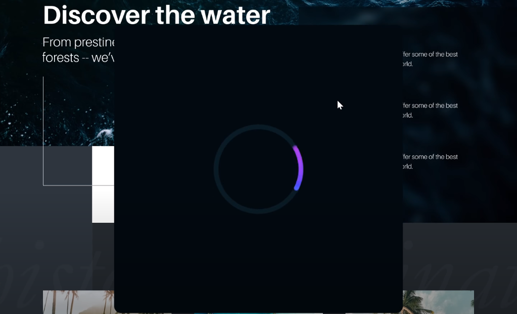
Now, we don’t want to just see a loading icon the entire time. Next, we’ll add in more titles and descriptions that give more details of the destinations the reader could visit.

And that's it! Make sure to take a look at the Youtube video as it goes into more detail how to exactly create all the elements above in Figma.
Interactive uEye Challenges
Now if you're interested in improving your own design skills or want to make a career out of UI design, my interactive UX design course can definitely help you. Click the link below for free UI design challenges:
https://designcourse.com/app/course/ueye
Here's a sneak peek of what's inside the free uEye challenges.
When you first login to the free course, you'll see modules and challenges that will sharpen your UI skills.

Let's take a look at the activity feed challenge.

On the left hand side, you'll see 7 different design concepts:
- White space
- Contrast
- Color
- Typography
- Scale
- Alignment
- Visual Hierarchy
All of these are in UI design, and understanding them is also extremely important. So these little challenges are going to help you develop an eye for all of these UI design fundamentals, which is absolutely crucial. It's a requirement for you to be able to design awesome-looking user interfaces.
The goal of each challenge is to choose the options that show the incorrect application of fundamental UI concepts.
As you get your choices correct, the example will adjust its UI to reflect your answer choice.
Want more access to UI concepts? In the full course, there are over 75+ modules, 40 UI challenges, and over 16 hours of video content.
You can also sign up for my mentorship program, where I take a look at the work you've designed, and I provide you with actual feedback. This will really help you improve to become a better designer and get this. As of January 2022, I've already received nearly 170+ design submissions!
We are also actively working on building out a certificate system for those who complete the course.
The link below will give you more information about the full course plus FAQs.
Hope to see you in there.