A CTA (Call to Action) is any element that seeks action from a user in a UI design. A CTA can take shape in the form of a button, a form, or even a scroll indicator.
In the context of a landing page, you most often find CTA's in the hero section and in the navigation.
What is a Primary CTA?
The primary call-to-action is the single action that you want a user to take. In most cases, the CTA takes shape in the form of a button. Something someone clicks, to either purchase a product, or proceed to some other page.
Additionally, if there's a *primary* CTA button, there might be a secondary CTA button.
In this case, it's vitally important that you distinguish the two in terms of aesthetics.
For instance, observe the example below:
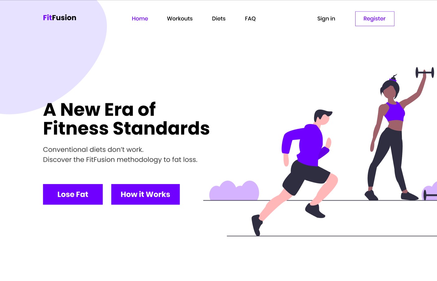
The primary and secondary CTA buttons in the hero sections are styled exactly the same. This is exactly what you don't want!
Clearly, one of these two buttons are of more importance to the user. Why style them exactly the same? You shouldn't.
Try this, instead:
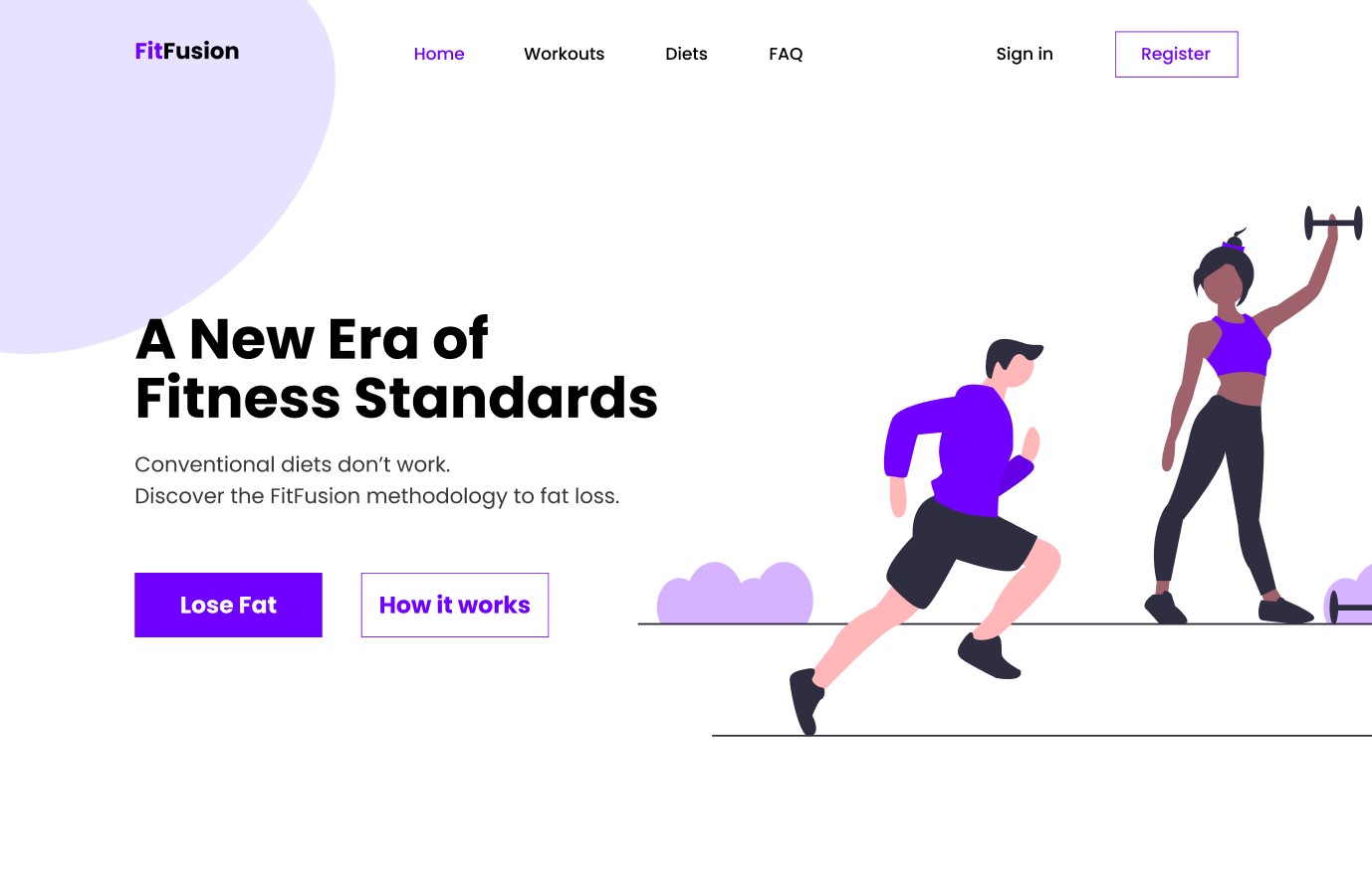
Notice how through the use of a difference in background color and a stroke, your eye is more drawn towards the "Lose Fat?" button? This is the button that would likely be clicked more if you were to perform a split test.
Visual Hierarchy
I talk about VH (Visual Hierarchy) a lot. The way you establish a primary and secondary CTA is through the use of visual hierarchy. Visual hierarchy is the process of directing the eye to the most important elements of a design, by utilizing various design fundamentals. Alignment, contrast, color, white space, typography, scale --- these are all ways in which you can structure visual hierarchy.
In the example above, we changed the background color to white on the secondary CTA, and by nature, this will draw less attention to it as there's another button nearby that has a background color that contrasts significantly more.