Lacking visual hierarchy in your designs can make your project look amateurish and boring (even if you get everything else correct in your design). Let’s look at 4 different examples to see how we can use typography to make our designs look more visually appealing.
Would you rather watch a video on Typographic Visual Hierarchy in UI Design?
The following tutorial is based on the video above. So, let's get started!
Example #1: Website Footer
This is a typical footer navigation pattern for a website.
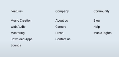
For typographical visual hierarchy, the first thing we have to ask ourselves is how many different kinds of text do we have that are neighboring each other?
In this case, we have two kinds of text:
- The titles for each of the three columns (denoted by Features, Company, Community)
- The individual links
The main problem is that the titles and links are all styled the same. One good thing is that there’s white space separating the titles from the links, but it’s not enough to create visual clarity. There are many ways to create visual separation.
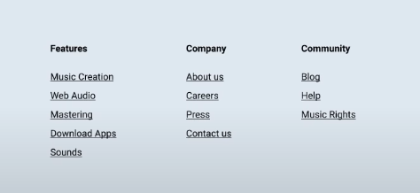
The easiest way is to focus on changing the style of the titles by:
- Making them bold
- Increase the font size
- Use color and contrast
We can also change the appearance of the links by underlining links, like this:
Example #2: Feature Section
Here’s a feature section that consists of a headline, subheadline, and description.

When all three look the same, you’re not really sure where to look. It doesn’t make sense because there's no visual hierarchy.
This is how to deal with the type in this scenario:
- Heading - Increase the font size and make it bold
- Subheading: Slightly increase the font size (but don’t match the font size of the heading)
- Description: Move it down to create more white space and add contrast to the text color

We can take it a step further by adjusting the following aspects with the subheading:
- Decreasing the font size
- Capitalizing each letter of the subheading
- Adding letter spacing between each letter
- Creating a rectangular container with an tinted background

Example #3: Body Section
You’ll usually see this body section right after the Hero section of a website.
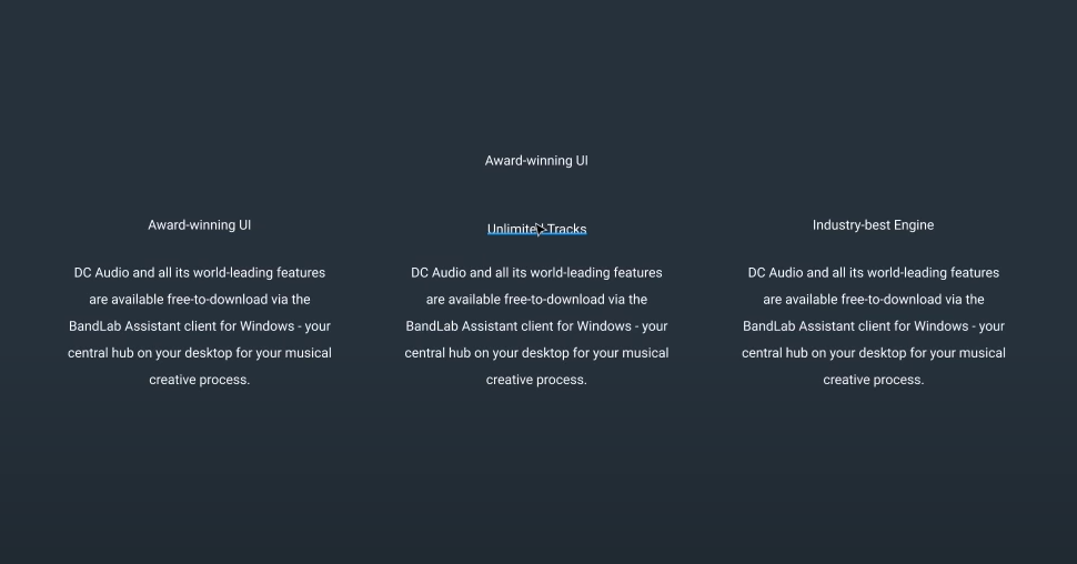
Here we have a section heading, a title, and a description that all look the same. We can make some simple changes that have a significant impact and allow for better visual hierarchy.
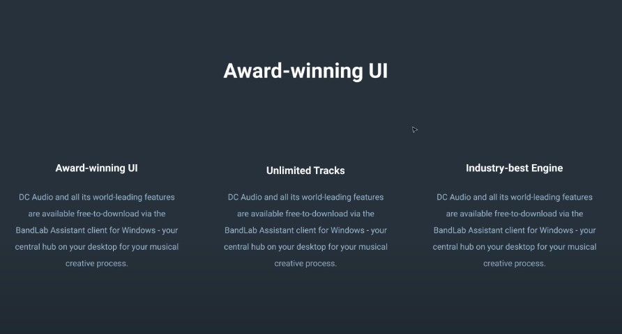
- Section Heading - Make the font larger and bold
- Titles - Make them larger and bold
- Description - Add contrast by changing the color of the text
Example #4: Blog Post
Here we have a white blog post with plain text.
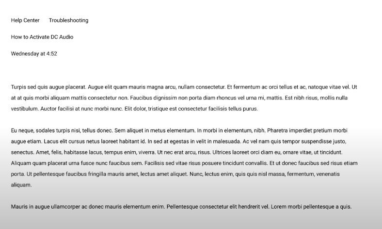
The first question to ask is - What is the most important element of this page? The title! (since it informs the user what the blog post is about). Here's what we can do with the title:
- Increase the font size
- Make it bold (you could also play around with making the text thinner than the body text since that also creates visual contrast)
We can also improve the visual hierarchy of the breadcrumb navigation links (denoted with “Help Center” and “Troubleshooting”) by:
- Adding a subtle graphic in between them (like a circle)
- Underlining them so that it’s obvious that these are clickable links
Finally, the date can be changed by:
- Changing the opacity so that it’s a lighter color
- Making it bold
- (Optional - you could also add some color based on the brand design)
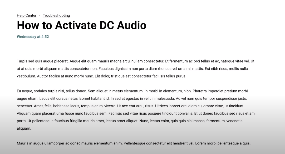
Do you see how visual hierarchy helps each element be defined in its own space? Remember, it’s all about knowing how to make each element appear different from the other.