Creating color schemes for websites can be quite challenging. A lot of designers struggle to pick the right colors for their designs and end up creating pages that either doesn't have good contrast or just don't look good in terms of aesthetics.
It is really important to ensure your page has a good color scheme as it is the first thing the user might notice and would impact the user experience significantly.
In this tutorial, you will learn an effective technique that will help you to confidently create a color scheme from a random color in 4 simple steps. This works for designing both light and dark-themed pages.
Would you rather watch a video on Creating Color Schemes?
The following tutorial is based on the video above. So, let's get started!
The Initial Page Design

So here is the initial page design we have. This page contains a lot of elements we need to consider- the navigation bar, the logo, cards, buttons, etc and we'll be choosing colors for all of these elements using a single approach.
Using this page as a base we'll experiment to come up with different color schemes. So let's get started.
Step 1: Choose a random color
You can pick any color of your choice for this step. But if you feel overwhelmed and want to randomly choose you can also consider using random hex code generators available online.
In this tutorial, this random color generator is used but feel free to use any color generator of your choice.
The color used for this example is a darker shade of purple and the exact hex code is #890388
Step 2: Decide between light and dark mode
You can either choose based on your preference and needs or if you want to try this technique unbiased then you can use this to randomly get a theme picked for your design.
The theme chosen for the demonstration is dark.
Basic Color Theory
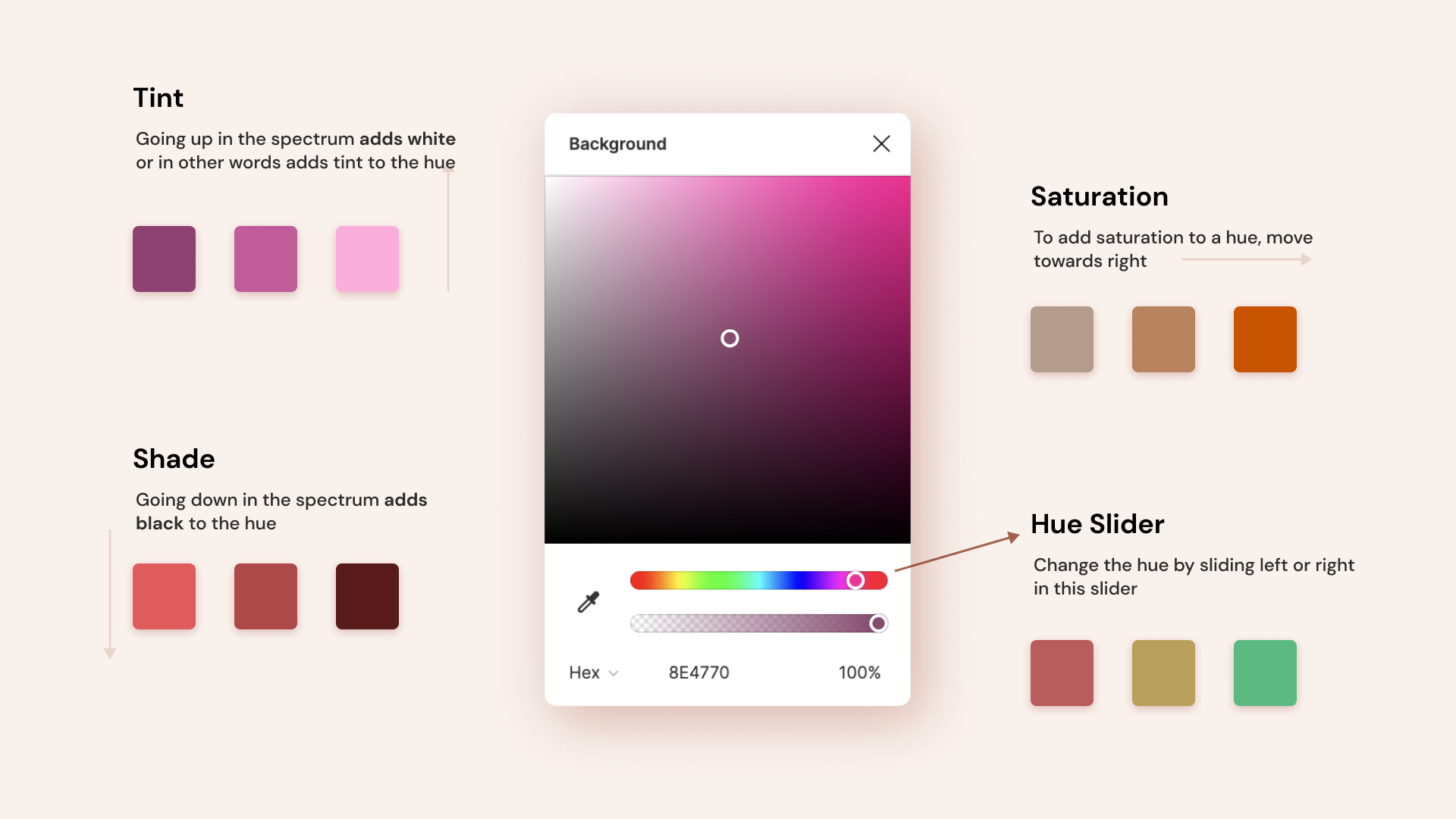
Before moving on to the further steps, it's important to understand certain things about the color picker or wheel. Don't worry, we only need to know the terms - hue, saturation, tint, and shade. Without getting too technical, let's just try to understand them and put them to practical use.
- Hue: To put it simply hue is just what most mean when they say color. Red, Blue, Green etc are different hues. In the color picker, you can find the hue slider below the color spectrum which allows you to change the hue (see image below).
- Tint: Adding white to a hue is calling tinting and this makes the color lighter. To add tint, simply move to top in the color spectrum.
- Shade: Adding black to a hue to make it darker is called adding shade to the color. Move towards the bottom to get different shades of a hue.
- Saturation: A color is saturated if it is intense. To increase or decrease saturation, move horizontally along the color spectrum.
If this still doesn't make sense fully please watch this video for further explanation and examples.
Step 3: Establish the background-color
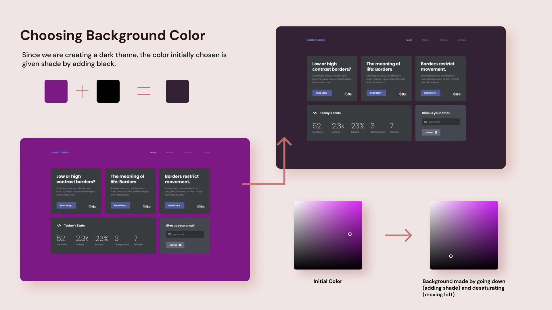
The background color is going to take most of the space so it is what's going to set the stage for the design so this step is really important.
Try to avoid staying in the middle of the spectrum. Generally going light, that is, going to the top of the spectrum would help you create a light-themed design while going down would let you come up with a dark theme. Don't worry about the saturation, you can use a saturated or de-saturated (low in saturation)color and this method would still work well.
In this tutorial, the color chosen is on the de-saturated side, the exact hex code used is#352335
Step 4: Define colors of other components
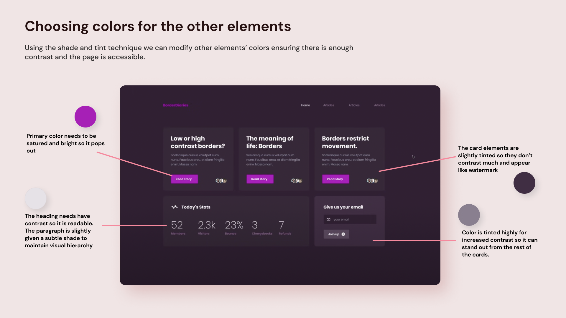
In this step, we can go ahead and decide our primary color. First, just color pick the background color and make it really saturated and add tint. When you do this, you'll notice that this provides good contrast and makes the element pop despite being the same hue. The primary color is used for the heading as well as the buttons within the card elements.
For the cards, you can pick the same color as the background once again and proceed to either add tint or shade. In this example, the cards have been given a subtle tint so that they appear like a watermark and don't have high contrast.
An important thing you need always to make sure is that the text on your card or any element needs to have enough contrast so it remains accessible to all users.
In case you have a card element that needs more contrast, simply add a bit more tint. This will help direct users' eyes towards this element which in turn maintains visual hierarchy.
Using the same approach try using the same hue on other elements and modify the color by either adding more tint or shade. Feel feel to use pure white or black if needed. Design is an iterative process so make sure to experiment to find out what colors work the best together.
And that's it! You now have a dark-themed web page created from a random color
Creating a light theme
As mentioned earlier this method even works for light theme, so let's try one again.
The color that was generated was red (the exact hex code is #f90a17).
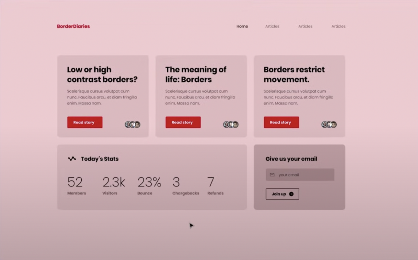
Since this going to be light-themed, the background is given tint and made really light. The primary color is made by first choosing the background color and increasing the saturation.
For the cards, shade is added for the background (you can also add tint if you prefer). Similarly, the rest of the elements are given colors using the same approach. After a few iterations and minutes of experimenting the final light-themed page is created.
Let's compare all the three designs together side by side. As you can see, all the designs have a good color scheme and it only took a couple of minutes to create these.
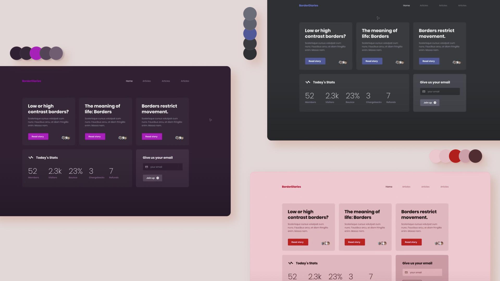
Try implementing this technique and experiment to get the hang out of it and have fun experimenting.
If you found this tutorial helpful and are interested to learn more about colors and web design check out the DesignCourse Channel on YouTube.